So we know what accessibility, disability, and universal design are - now how do we apply those principles to our website? The following are the things we can do on our website to make it as universally accessible for everyone as we can. Our website is a work in progress - and things will change as standards change.
It is worth noting that the Faculty of Education Communications team only has access to change certain aspects of the template we are given by the central Queen's website team. However, we are able to make requests for changes - and if you have ideas, please let us know and we can request them.
If you have a tricky piece of content that you are trying to figure out how to make accessible on the website, please reach out to the Comms team. We can help you troubleshoot the issue and have plenty of experience with making content work within the template of the website.
Screen Readers
Many of the accessible features on our website are done to make sure that screen readers, used by people who have limited on no vision, are able to find the information they need.
Understanding how screen readers work makes it much easier to make sure you are fulfilling many of the accessible features of the website.
This video from the University of California - San Franciso demonstrates how screen readers work and why it is important to use headings, alt text, and properly formatted tables on websites.
For more information on frustrations faced using a screen reader on websites, Holly Tuke, a person who is blind, discusses some of her frustrations in her article, "The 5 most annoying inaccessible web elements I face as a blind person every single day, and how to fix them."
Use Headings
Every webpage should be structured using headings that follow a logical structure. Screen readers use the headings to help screen reader users navigate content. Aside from screen readers, headings also help to visually break up text.
Our website template has Heading 1-6 available. Heading 1 is only used for the title of the page - so you have access to Headings 1-6. Heading 2 is the next level. So, for example, on this page each different topic about accessibility has Heading 2 - while subcategories use Heading 3.
A good run-down about headings is available on the Scope website.
Find out more about headings
The Human Rights and Equity Office offers free online training about making accessible documents. The principals of accessible design for documents also hold true for our website publisher.
Label Links and Buttons
People using screen readers need to know where a link is going to lead them. One of the most common accessibility issues we see across our communication channels is people using vague directives like "Learn more," "Click here," or Contact us." None of these provides information about what the link will lead to for people using a screen reader. Instead, you should be hyperlinking the text that describes where the information is leading. For example, instead of saying: "For more information about Queen's Faculty of Education's Regulations and Policies please click here. You would say "Find out about Queen's Faculty of Education's Regulations and Policies."
Other accessibility issues to keep in mind when you are hyperlinking text:
- Avoid language that requires spatial and visual references - for example: as the video to the left says. Not only does this not hold true for people using screen readers, but our website is device responsive which means that things will look different on a mobile phone than they will on a desktop - so you can't count on the information being in a specific place.
- When you link a file, indicate the format and document size. For example, Document I am pretending to Link (PDF 123 MB).
- Avoid linking in a new browser window.
Hyperlink web accessbility
Messy HTML
Messy HTML sounds scary and it can become a big problem for accessibility on our website. HTML gets messy as things are copied and pasted from document to document - and the indentation, font size, and inline styles might get copied over.
Unfortunately, our website does not automatically strip the text you copy-paste of HTML formatting - which means that if you copy and paste it directly into the website text box, all of the extra HTML formatting will come with it. Luckily, our website has a 'tolerance for error' (one of the principles of Universal Design) and it will ask you if you want to clean it before pasting it on to the website.
Why does messy HTML matter?
Basically, messy HTML means that the text isn't formatted in the same way as the rest of the website and that can cause accessibility issues (along with branding ones!). If you copy and paste formatting from a Word document onto the website, zooming in and out of the text may not work, using night-mode might not work, and there can be issues for screen readers - particularly with reading lists or numbered items on the website.
How do you fix it?
You can use a program like Microsoft notepad or a website like Text Fixer and copy and paste your text into them, then copy and paste the text onto the website.
Once you have done that, you will need to add headings, specialized text features (bold, italic, etc.), and links back into your text. It takes a little bit of extra time but it means that everyone can access the information on our website.
Tables
Tables in any form are not super accessible when it comes to screen readers in general - and we try to avoid them when we can. When you can't avoid using a table, you must recreate the table from the website template so that it is accessible for screen readers. We know it is time-consuming to do this - but copy and pasting from a word document table is not an accessible way to convey information.
Videos
How to embed videos on the website
There are a few different options for embedding videos on our website: Two Column Video/Audio Embed, general Video/Audio Embed, embed via iframe with html, or you can hyperlink to videos. The most accessible option is the first two which have accessibility features built into them through the website template. However, not all videos will embed through this template. Reach out to the Comms team to determine if linking or embedding is the best option for your video.
Overview
All videos or audio files that are embedded on our webpage must include captions for people who cannot hear. It is also a good idea in general because a majority of people watch videos on their phones without the sound on. It is best practice to also have a transcript of each video as well for people who are unable to access the video file.
Caption vs. Subtitles
Subtitles assume the audience can hear music, background sounds, or non-verbal content. Captions are meant to support people who are D/deaf and hard of hearing - so they include information about music in the background, or information about if someone whispers information.
How to caption videos
Different videos require different amounts of effort when it comes to captioning them. If you have created a video with powerpoint and a script, you can create a document with the text and upload it via YouTube and other platforms and it will automatically add them to your video. Make sure to add any volume level or background noise or music to the video descriptions if you have them.
If you hosted a webinar and there was not a script, you can have YouTube (and other platforms) automatically create captions. Unfortunately, they need to be read through and corrected. It is important to pay particular attention to land acknowledgments, words in other languages, and names. We stopped providing recorded webinars for 2023 as the captioning was very time-consuming and the videos only had minimal viewing. Talk to the Comms team if you are thinking about approaching this - and we can help figure out the best way to get captions on your videos.
Other accessible considerations
There are also ways to make videos accessible for people who are blind or have low vision by having voiceovers that describe what is happening in the video available. Humber College has a module called Making Accessible Media that goes into detail about how to do this.
Video Resources
Pictures on the website
Text on images
Images are an important part of any website, but we need to avoid using images with graphic text to exclusively relay information.
Why can't we use text on images?
When text or charts are added as graphics instead of HTML, anyone who can’t see the page will face a barrier to accessing that information. This applies, especially to those using a screen reader to read a page aloud.
Example 1: if you put the poster up on our website in a jpeg about an upcoming event, anyone using a screenreader wouldn't be able to access the information about when or where the event was happening. Best practice in this instance would be to write out the text on the website and use a smaller version of the poster (perhaps just the picture you are using on it) to advertise the event on our website.
Example 2: if you put up an infographic about your research on our website without any text outside of the jpeg image, people using a screenreader would not be able to find out the information you are trying to convey. In this instance, the best practice would be to figure out how to convey the information on our website through text and taking the actual visuals from the infographic to help illustrate your research. It won't look exactly the same as the printed design but it would be accessible.
Captions
The website template we have does not provide a very clear way to caption photos. The way it is set up, it interferes with the text and makes reading the captions difficult. Until that is fixed, we recommend avoiding the use of captions. But always make sure to use Alt-Text!
Alt Text
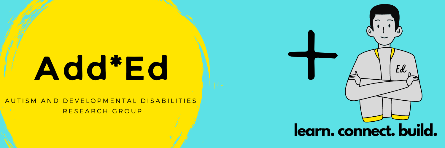
As you saw in the screen reader video, alt-text helps to explain an image to people who might not be able to see it. Every time you upload an image you should make sure it has a description of what is in the photo for people who might not be able to view it. For example, if you were to describe the Add*Ed Research Group's logo, it could be described as "a blue background with a yellow circle on the left and the words Add*Ed Autism and Developmental Disabilities Research Group, on the right is a plus sign with an image of a boy with a jacket that says Ed on it with the words learn. connect. build. underneath. "
Alt Text Descriptions of People
Something to keep in mind with the alt text - images that are used help to tell the story you are telling. Having a strong description of a person in an image helps to tell the full story to someone who is unable to see the photo. A full description includes race, age, and more. We have asked our EDI Committee to provide us with guidance about how we should be describing people in images on our website. Until we have the guidance, Carleton University has a good primer on describing people in alt text.